
Groundbreakers - A Timeless Game of Ages
Groundbreakers is an engaging board game, where players journey through different eras, from ancient civilizations to futuristic worlds, all while forging friendships and rivalries in in the fires of strategic competition. As they navigate through the ages, players will face unpredictable twists and turns, ensuring no two games are ever the same. It is about strategic planning and clever maneuvering, a fun and smart adventure through time.
In this project, I led the development of the brand identity and directed the visual style of the entire game. I undertook the responsibility of ensuring cohesion across all facets by creating a distinct brand voice, delineating the tone that resonates with our audience, defining the art and aesthetics of the game, while maintaining consistency across platforms. I oversaw the creation of AI-generated illustrations for the cards by making sure it harmonizes with the desired established style and aesthetic, while aiming for the highest level of style consistency (something not easily controlable with AI generated images). I also provided guidance to ensure that each component designed by other teams involved in the project (video production, graphic design) aligned perfectly with the brand and its aesthetics.
Moreover, I was in charge with the actual design of the card layout and other visuals that encapsulated the essence of the brand. Overall, I aimed to establish a compelling brand presence and a beautifully curated art style that resonates with our audience and elevates the "Groundbreakers" experience.
Crafting the brand's identity.
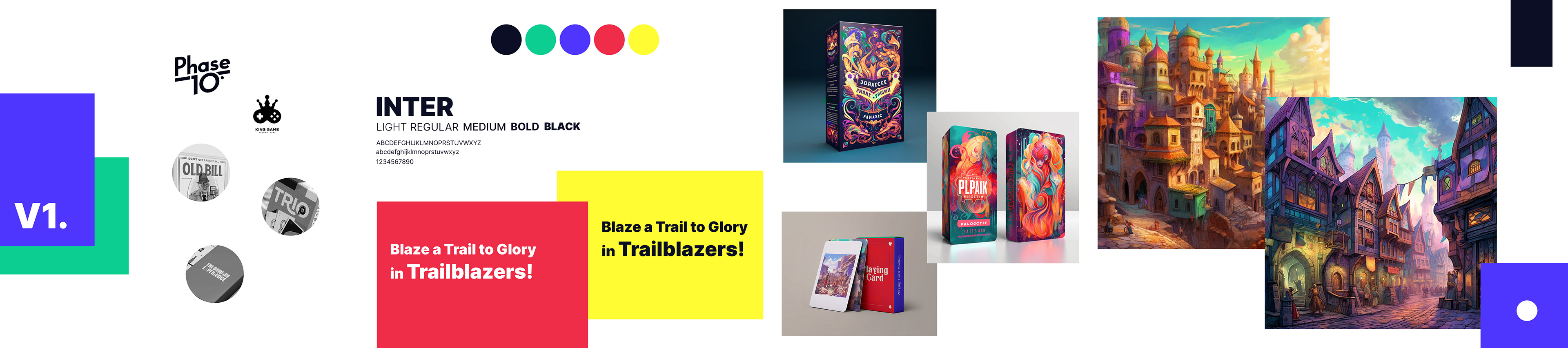
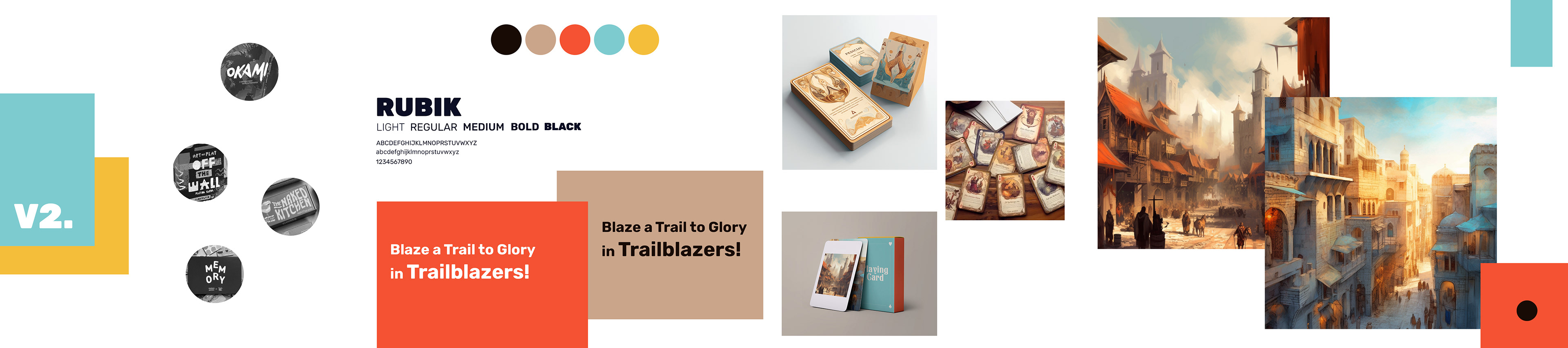
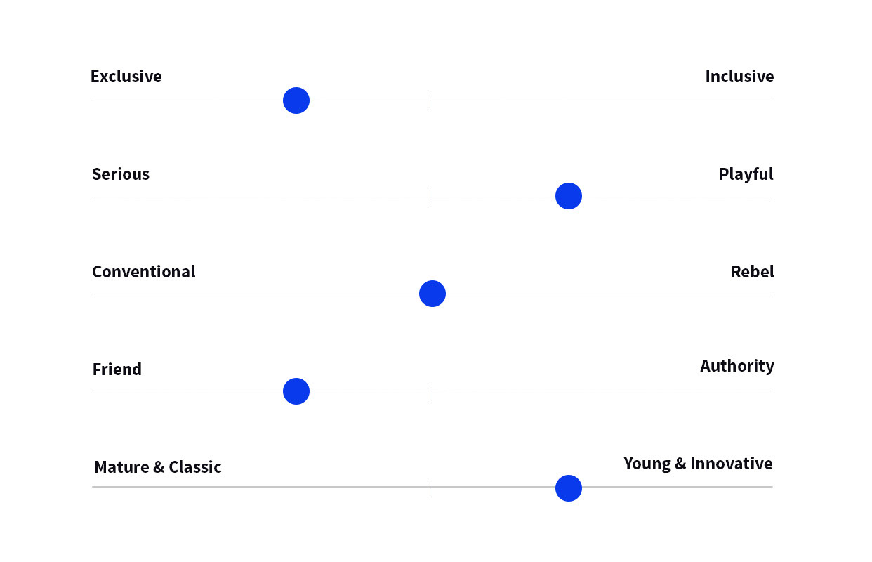
The process began with extensive exploration through stylescapes, delving into various visual directions to capture the spirit of the game. These stylescape explorations allowed us to uncover a diverse range of possibilities, from more geometric, modern, and innovative to soft, welcoming, and more approachable styles.
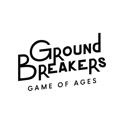
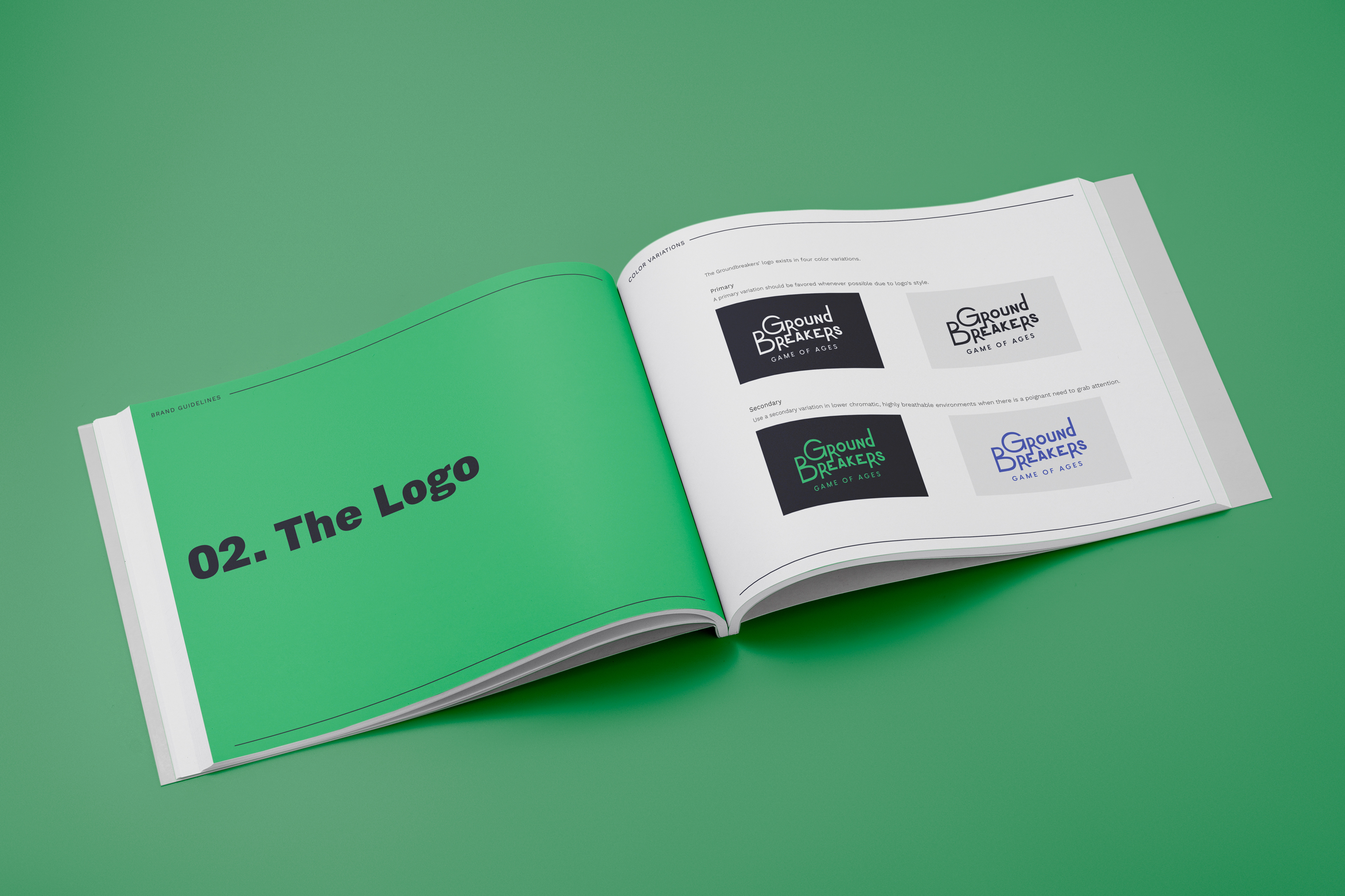
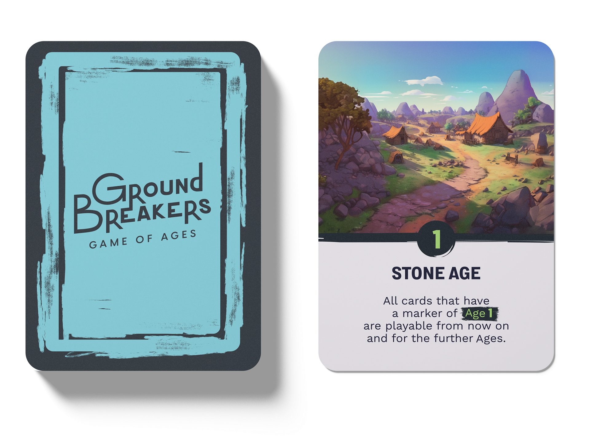
After exploring the brand's personality, we started to craft the logo as a cornerstone for this game's visual identity.
The concept combines elements of playfulness and sophistication, offering a unique blend of elegance and fun. The font is custom-drawn, and while it is geometric with sharp edges, it still retains a sense of human touch through its irregularities and varying letter sizes. This infusion of imperfection adds to the concept's friendly appeal, enhancing its overall warmth and approachability, just enough to position the brand more towards the Friendly end of the personality spectrum.
The craftsmanship suggested by the style of the logo, reflects the pioneering spirit of the groundbreakers themselves. Its irregularities also convey a sense of authenticity, individuality, and the personal touch that each player brings to the game. The font's oblique and inclined angles add a dynamic and energetic feel, signifying the game's strategic and competitive nature.
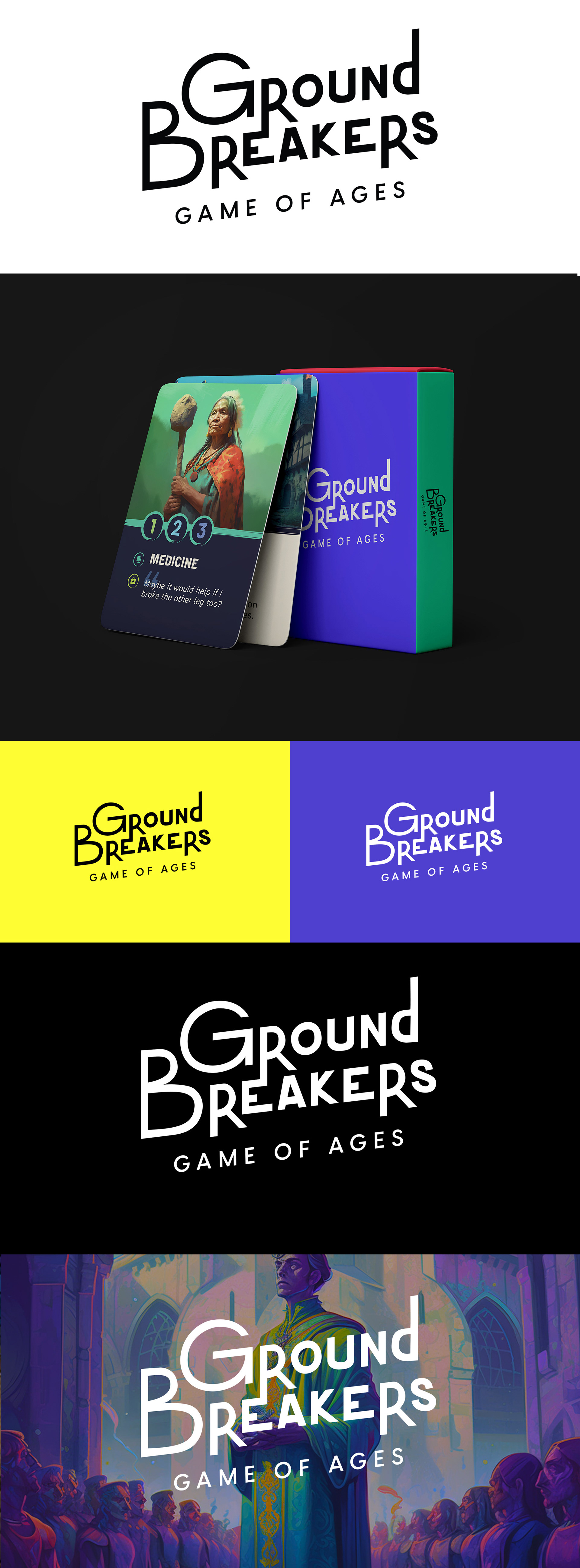
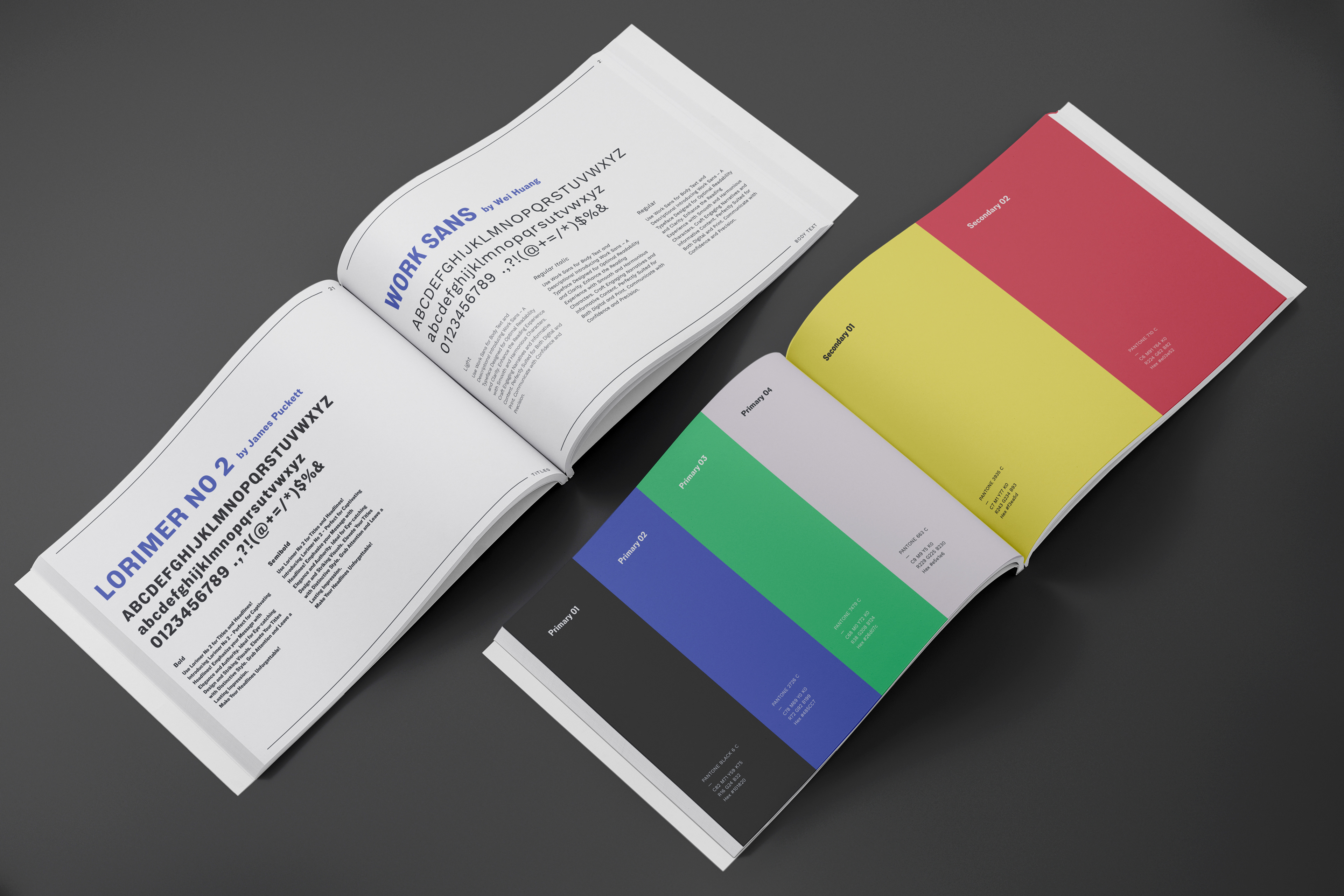
We curated a palette of brand colors that evoked the vibrancy and dynamism of the game and it perfectly aligns with the brand's personality. Each color was chosen not only for its aesthetic appeal but also for its ability to convey the various moods and themes present throughout the gameplay experience.
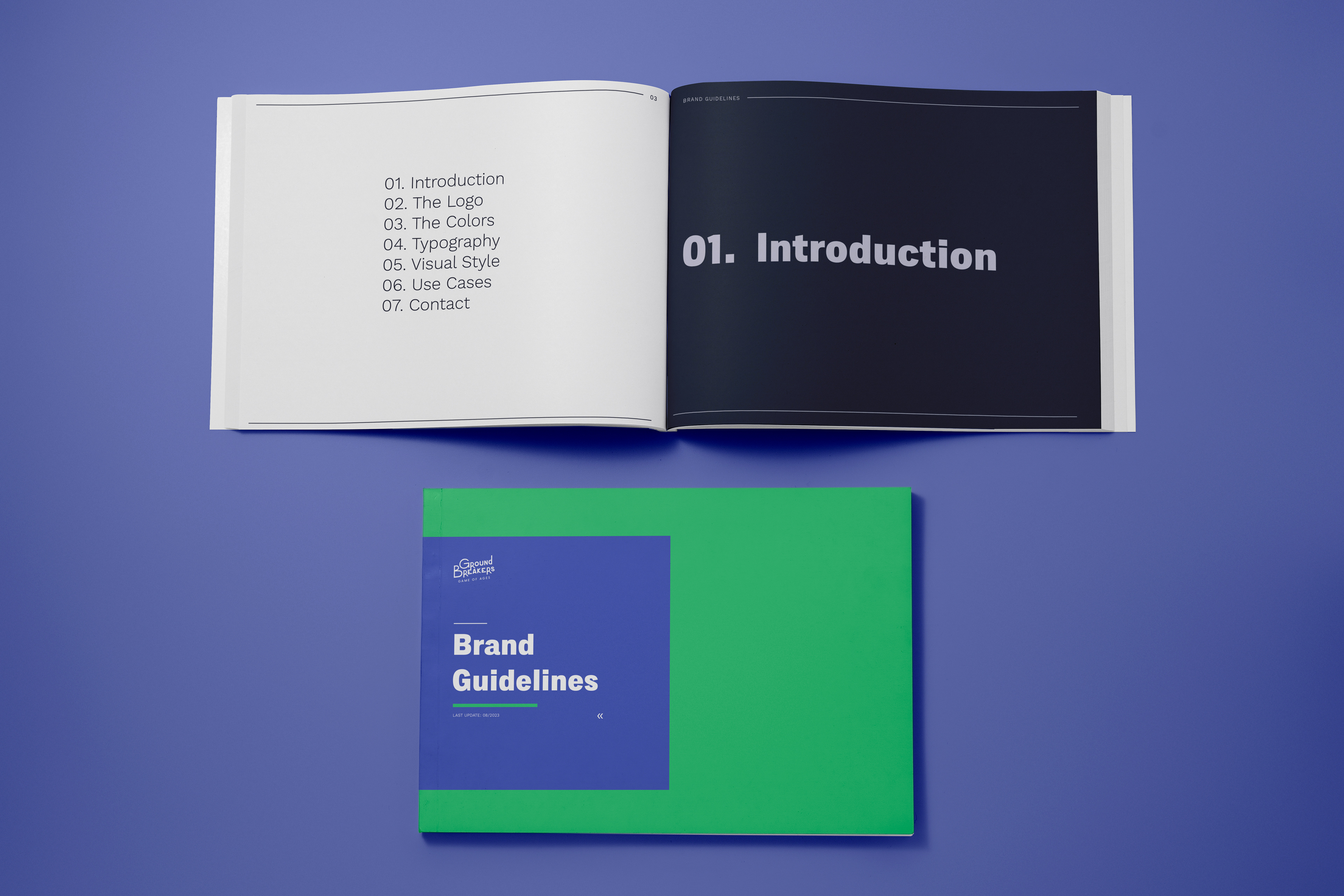
To ensure consistency and cohesion across all touchpoints, we developed and documented every aspect of the brand in a comprehensive brand guide. This guide served as a roadmap for all future creative endeavors, providing clear direction on logo usage, color applications, typography choices, and more.
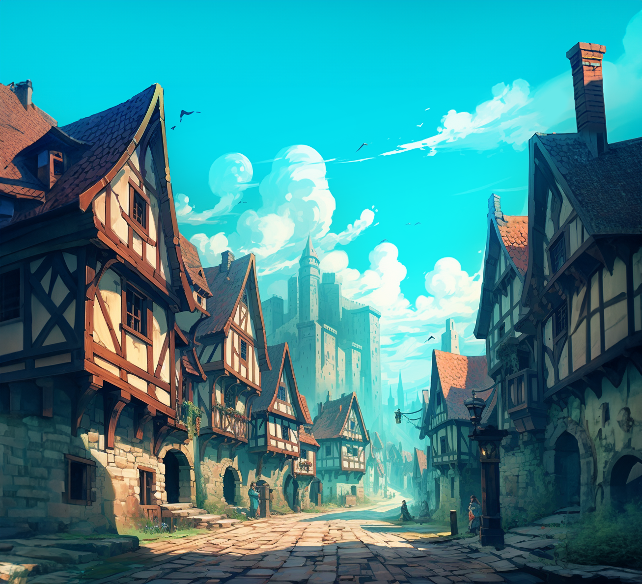
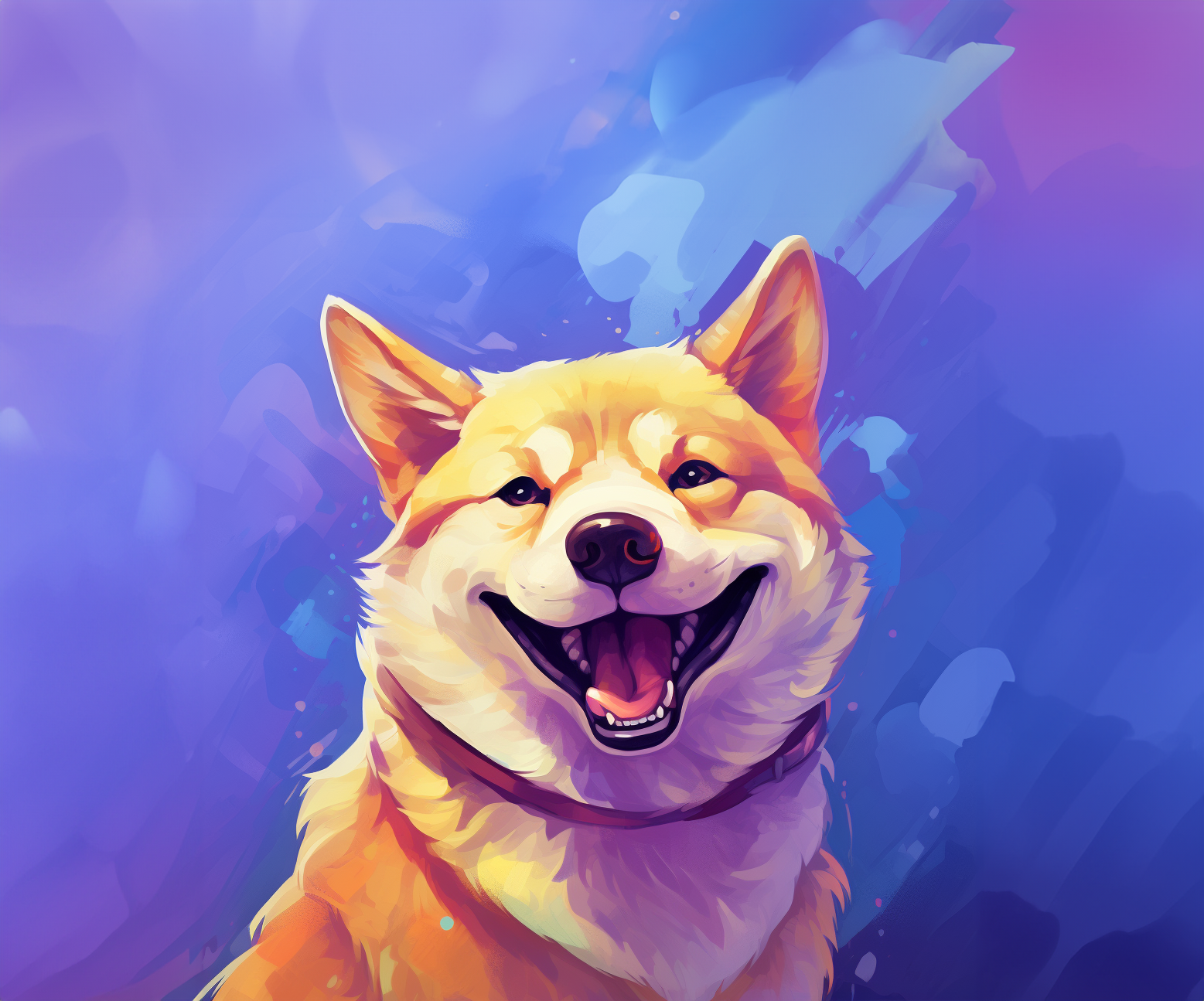
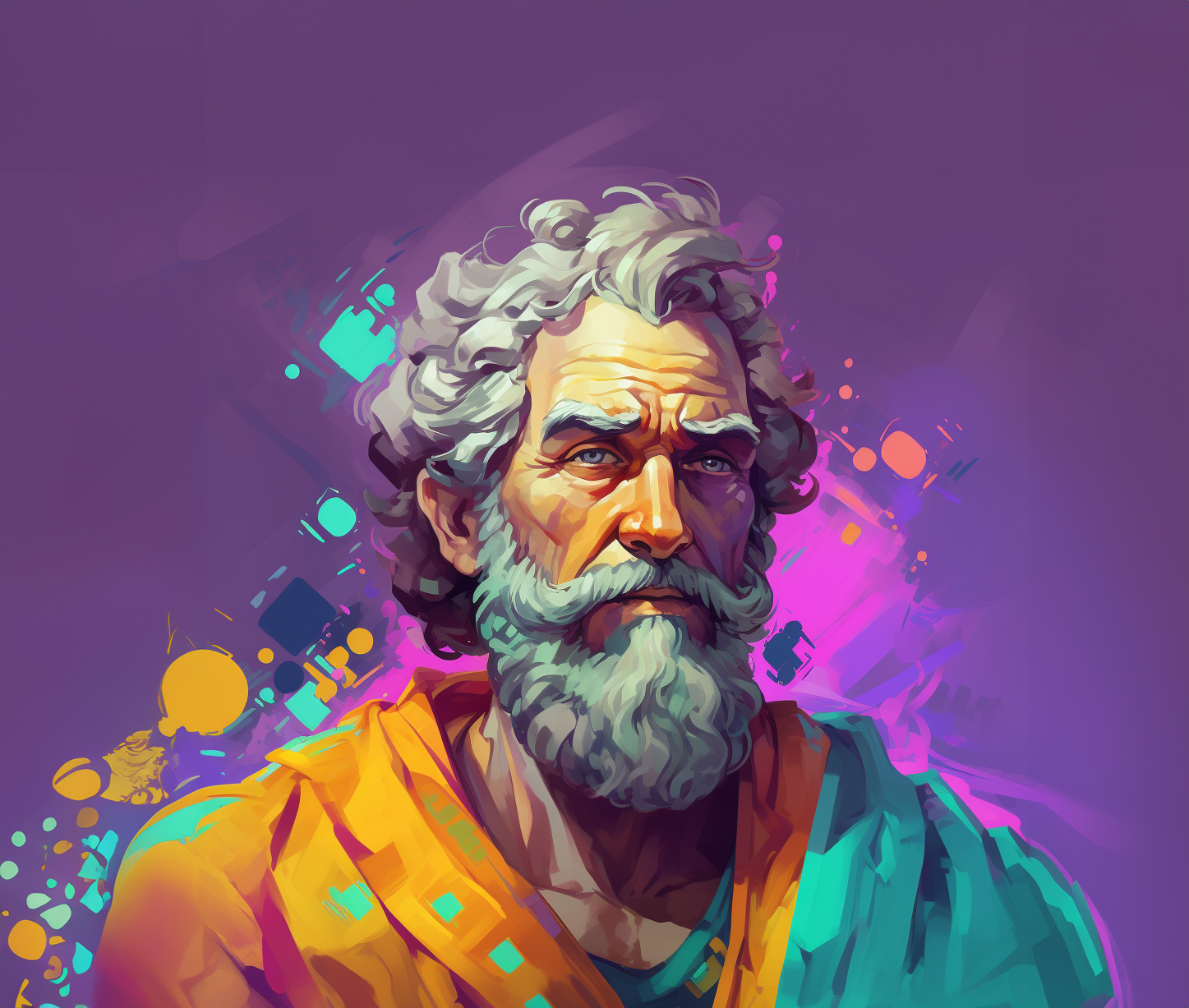
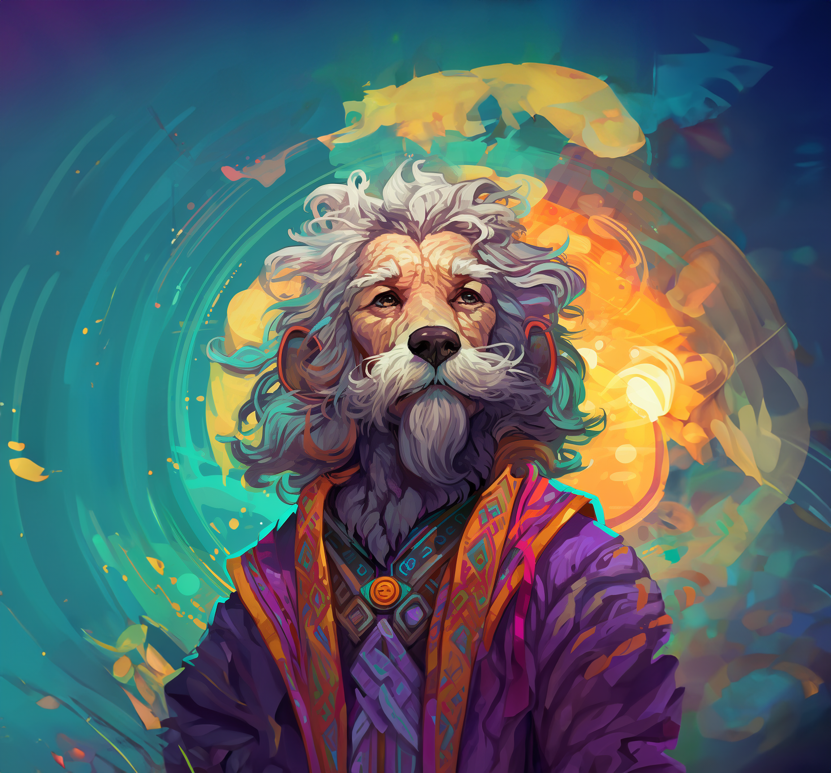
Visual Style & Illustration.
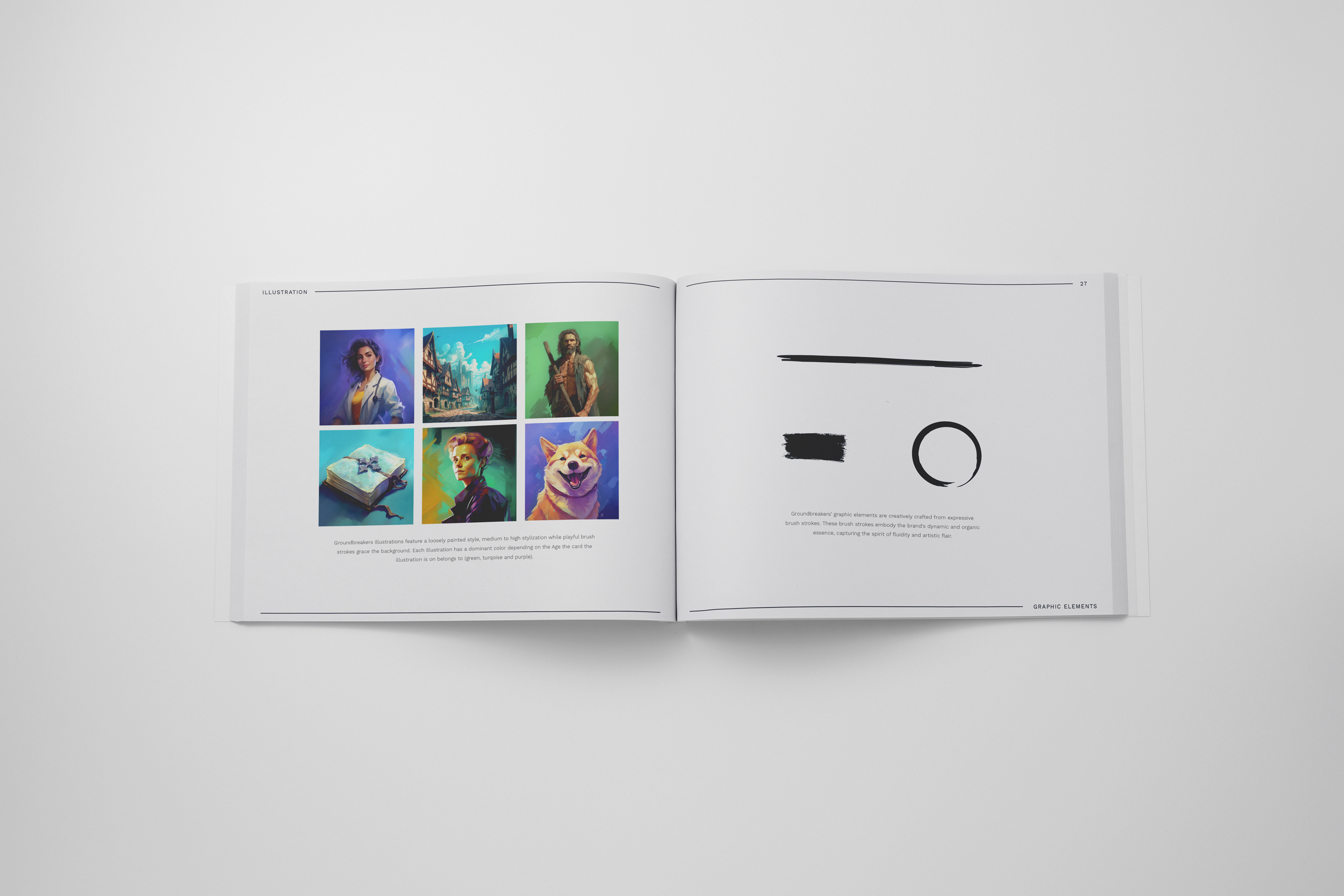
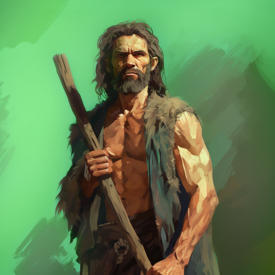
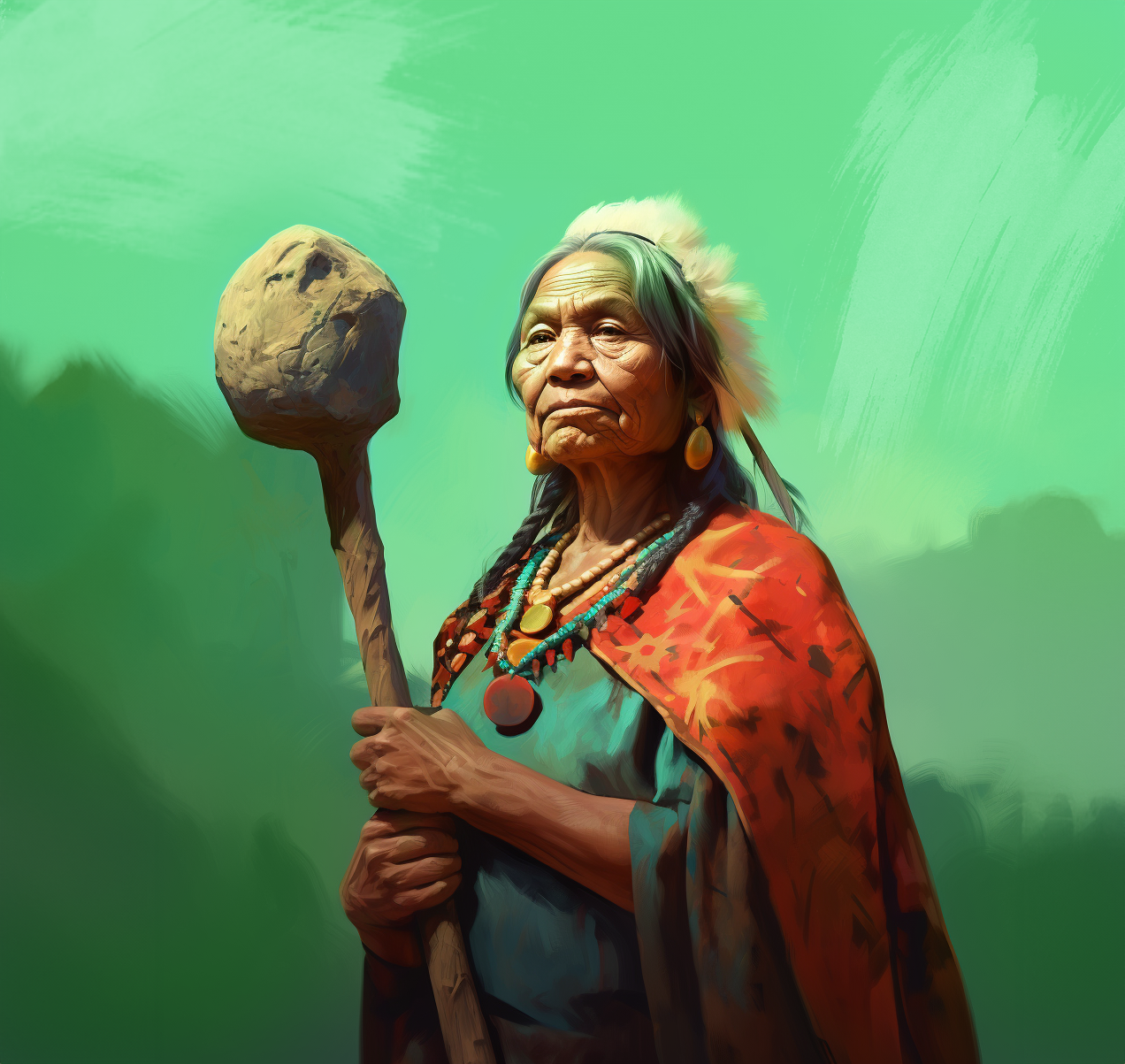
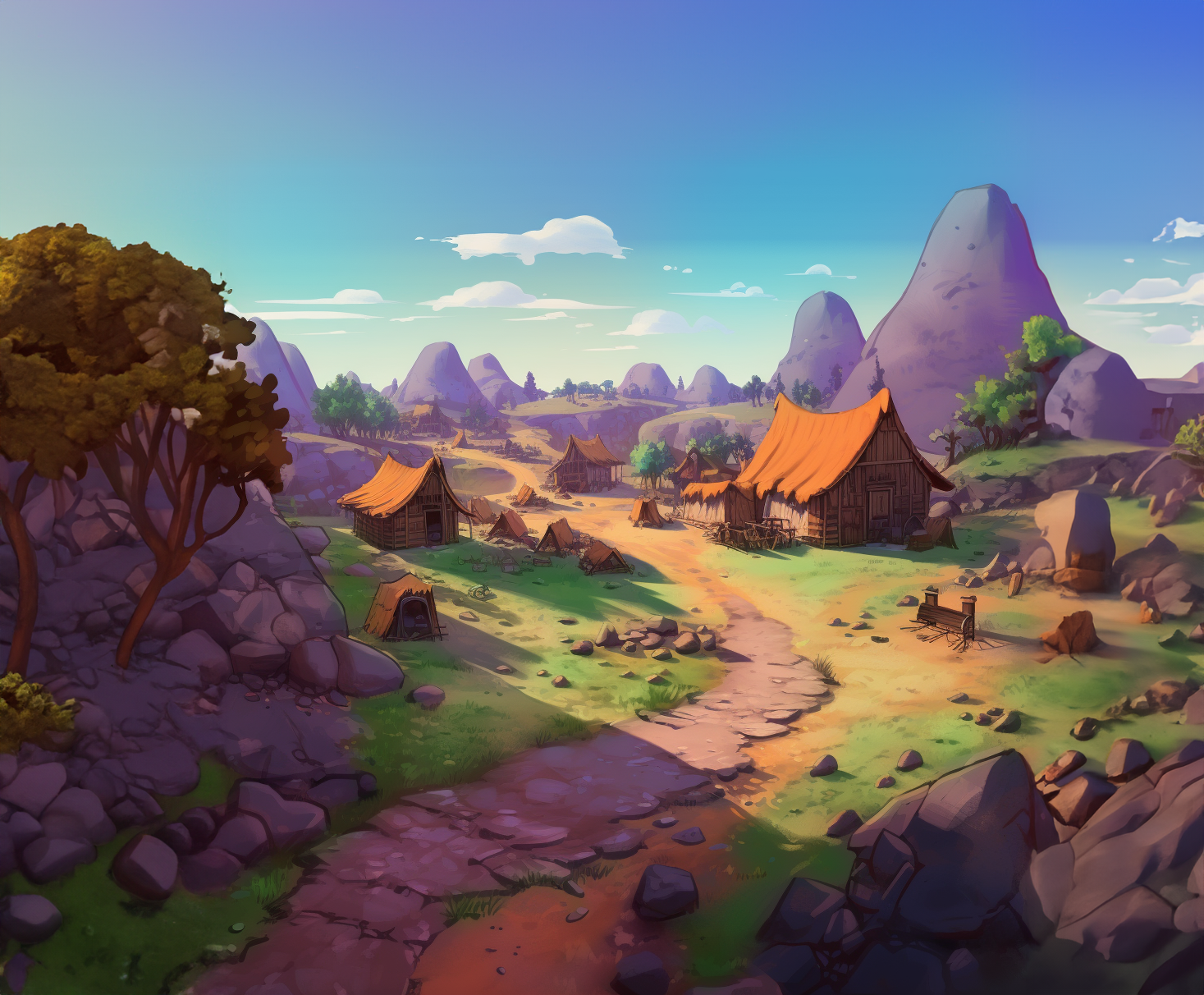
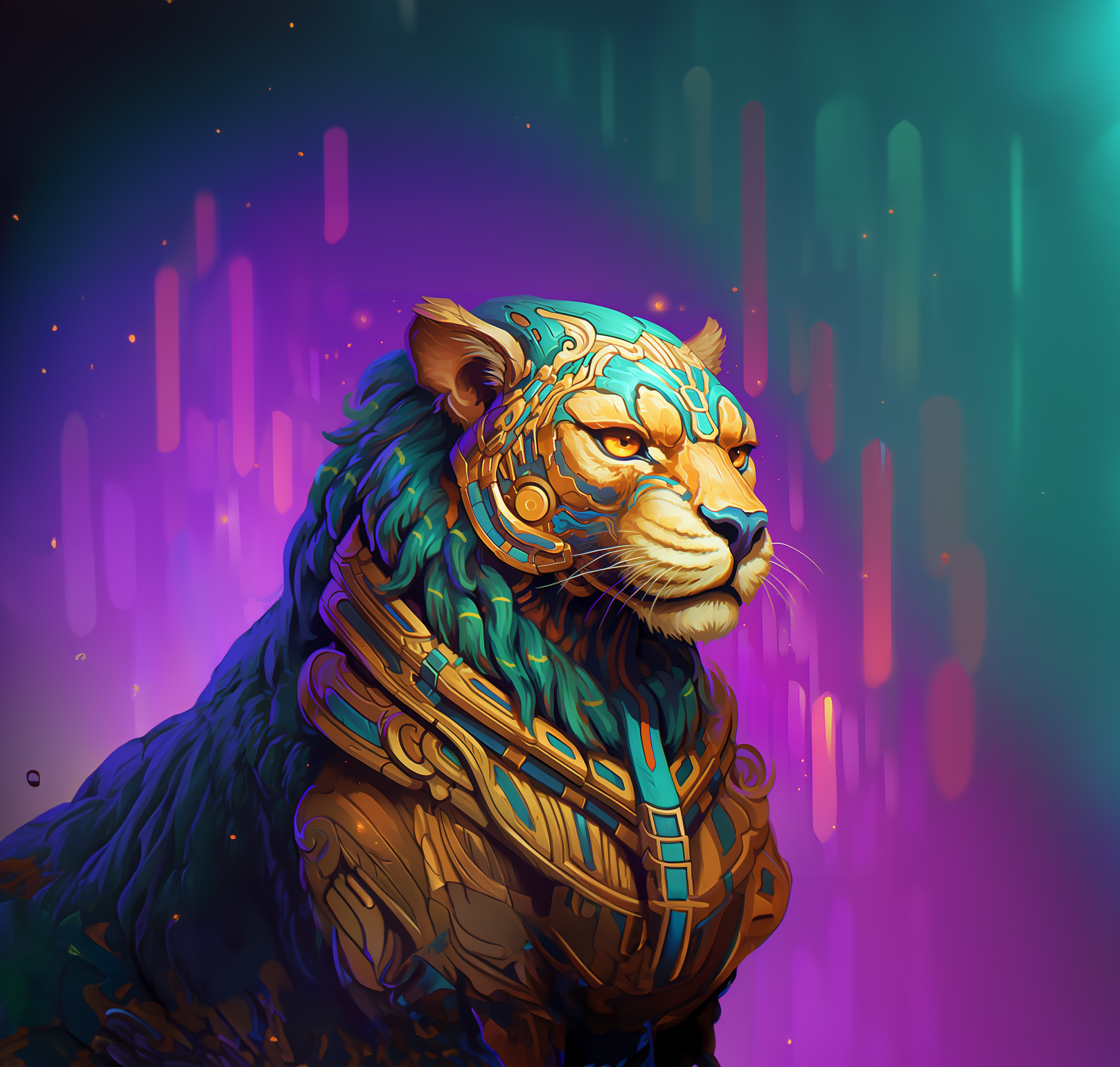
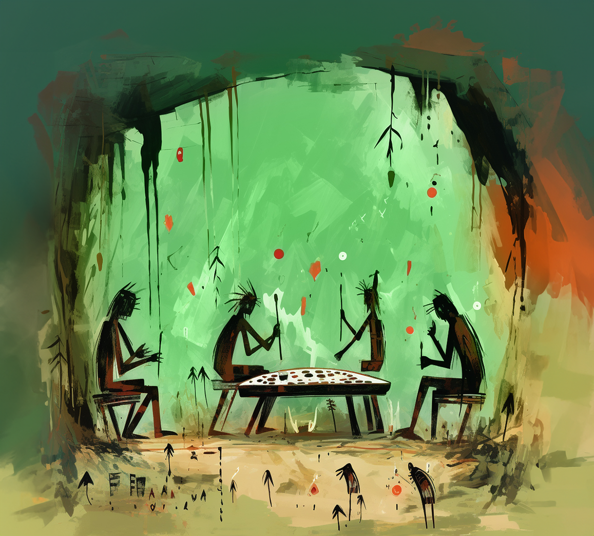
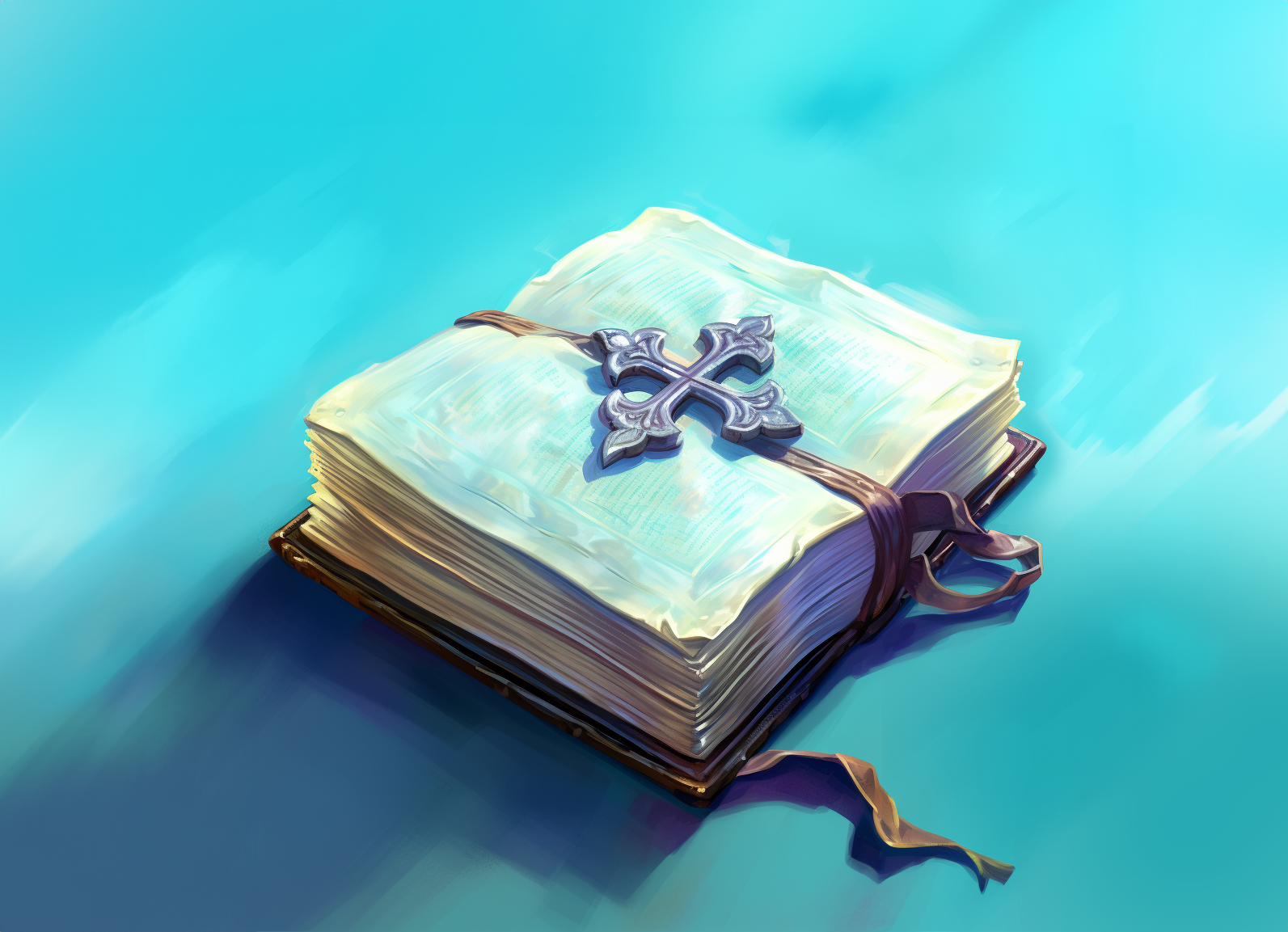
Groundbreaker's visual style is a celebration of detailed, loosely painted illustrations that come to life with expressive brush strokes. Crafted with care and finesse, the designs boast a harmonious blend of carefully chosen colors, creating a captivating and authentic brand experience.
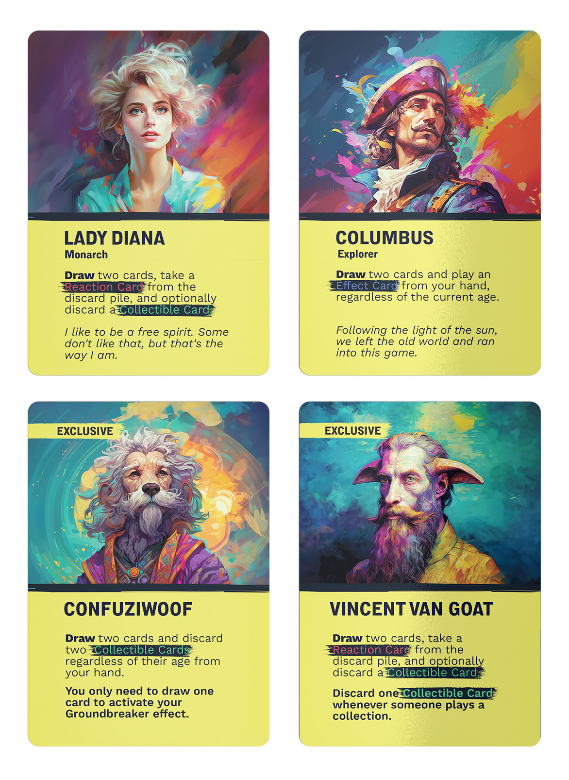
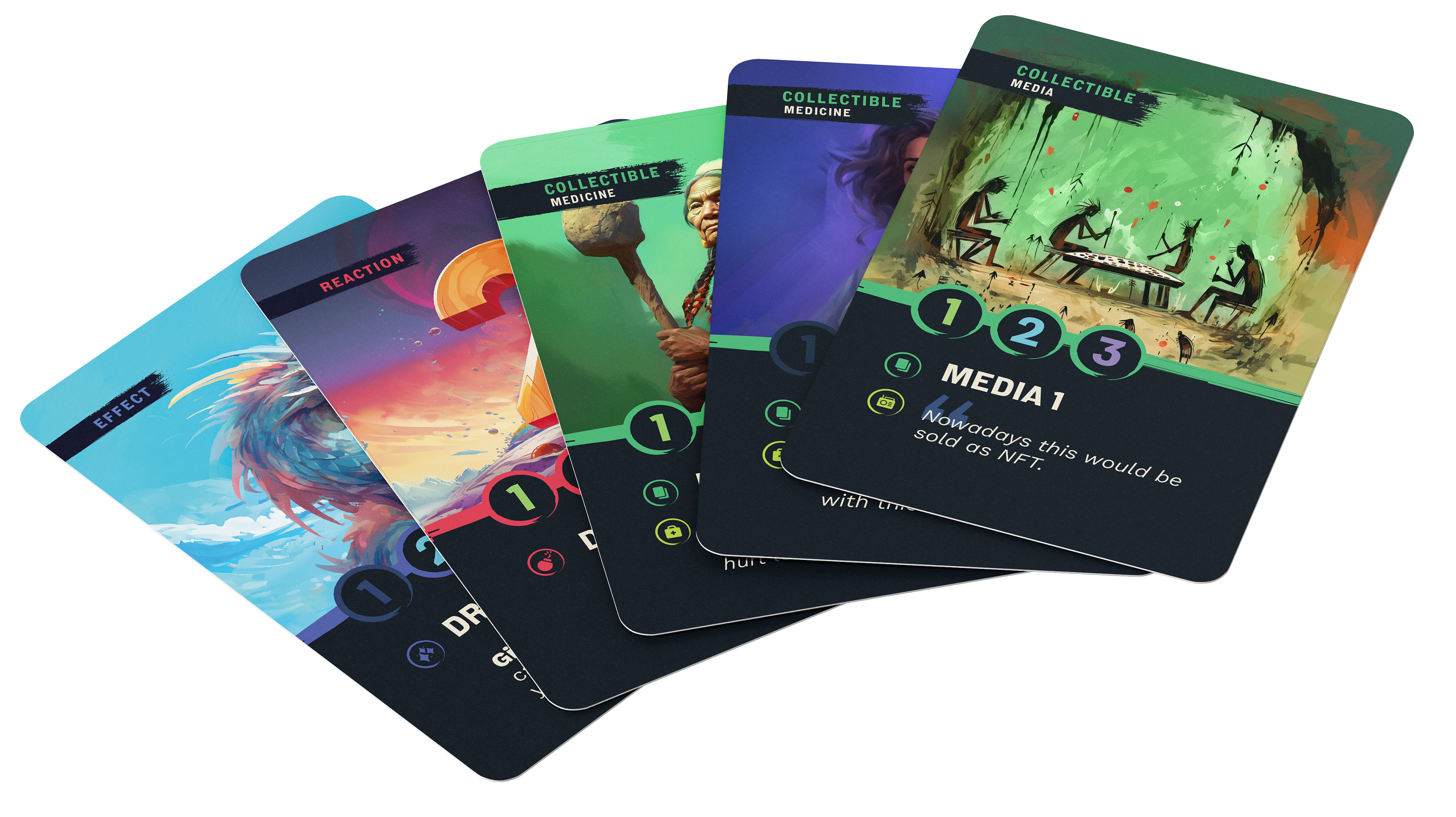
All illustrations were generated using AI (MidJourney), undergoing a series of trials and errors until we discovered the perfect prompt and parameters to achieve the results we were after and a greater consistency in style. This phase proved to be laborious, and my responsibility was to lead and supervise the entire process of generating illustrations, adjusting prompts, and selecting those that best matched our vision. I focused on achieving a cohesive art style characterized by a brushy texture, loose style of painting, organic, defining specific colors for each age while maintaining alignment with the brand, and ensuring consistency in the depiction of human characters and manually correcting AI's anatomy errors.


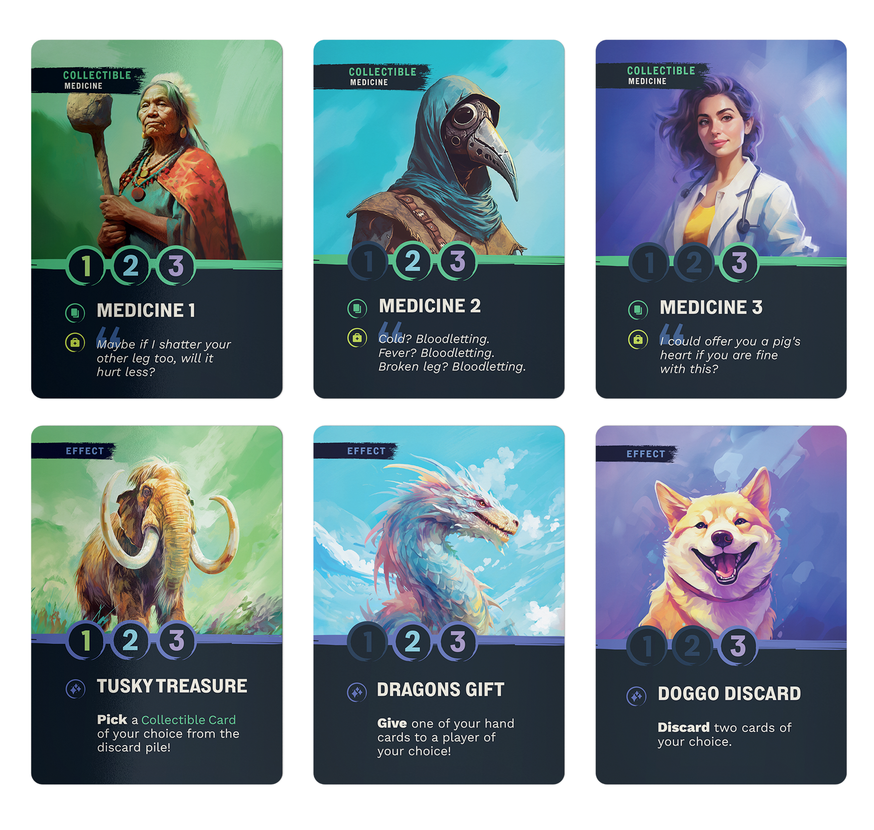
Playing Cards.
Designing the cards was a hands-on process from start to finish. My job involved a lot of different tasks, like designing the layout, and information architecture, assigning colors for each category, making sure the AI-generated illustrations fit just right, and finding solutions for any design problems that popped up during user testing.
I had to balance creativity with practicality to create cards that were not only visually appealing but also easy to use and understand for the players. Overall, my goal was to create playing cards that players would love to hold in their hands and that would enhance their gaming experience. It was a rewarding process, seeing everything come together in the end.
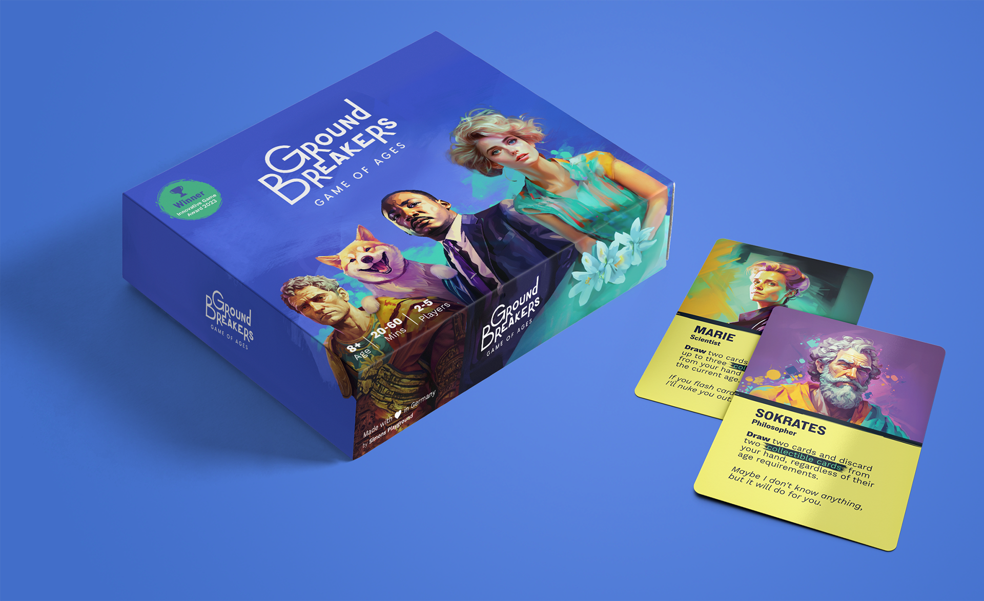
Packaging.
Designing the packaging involved crafting a visual representation of the game that would entice potential players and stand out on store shelves. From choosing the colors and imagery to designing the layout and considering the practical aspects like size and materials, every detail was carefully considered.
Throughout the process, I collaborated closely with the team to ensure that the packaging aligned with the overall brand identity and vision for the game. It was a rewarding experience to see the final product come together, knowing that it would play a significant role in introducing "Groundbreakers" to the world.
Do you have a similar project? Let's work together!